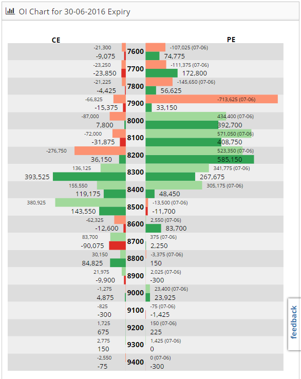
We’ve made some cool additions to Capital Mind Snap and one of the new additions is the Change in Open Interest.
On a chart that shows all the strike prices of the Nifty, we show the change in the open interest at each price.

The change in open interest for each strike has:
- Coloured deep red when the OI falls, or deep green when the OI rises (today)
- Coloured lighter red or green for yesterday’s OI change
- Calls on the left, puts on the right.
The idea is to give a one stop look at all the options contract of the Nifty, and you can see how the OI is changing. Data is about 5 minutes delayed.
You can use this to figure out how to position options strategies. One of the key things to know is – where is the market positioning Nifty moves? In the above graph, there is a relatively large amount of action in the 8100 and 8200 puts and in the 8300 calls. When the Nifty moves much more, action shifts to further time frames. It’s a great context to understand where players are concentrating positions.
We’ll add such charts for other stocks too soon – a drop down selection. Would love your feedback!


