This year has been horrible, you think. It has, indeed, been a rough year for stocks. But on the index, volatility isn’t exactly very high, because:

Thanks to Kiran for the motivation for this chart!
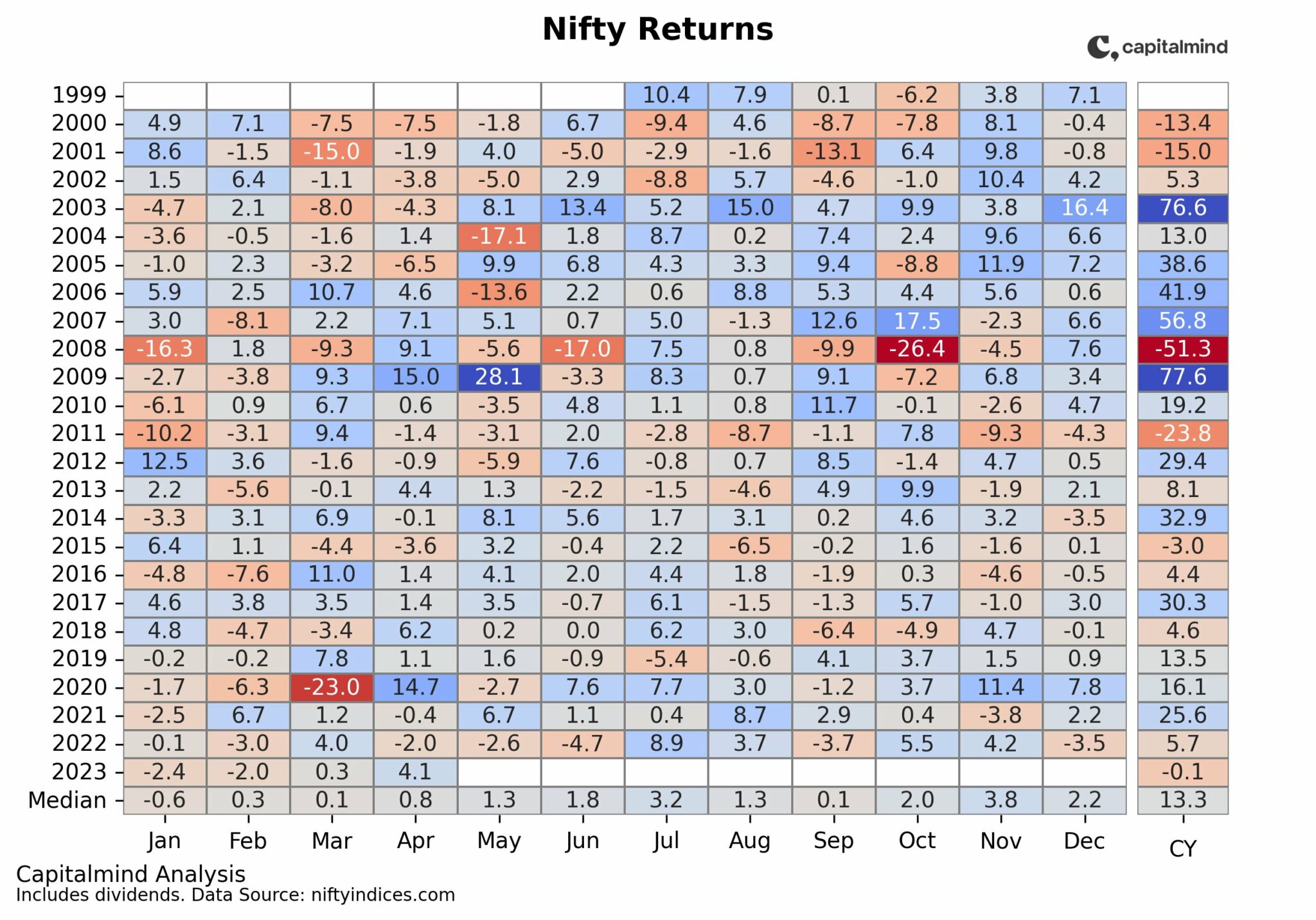
As you can see, we have only seen about 4 days in which the Nifty was down 2% (and one day it was up 2%) in 2018. In fact, the only years that come close are 2014 and 2017.
And if you’re thinking of 2008, don’t. Because it was so bad by October you wanted a 2% day just to feel sane.

And looking a little further – a 4% down week – again, there we’ve been relatively sparse in 2018 with just two such weeks (one was the week previous to this post).

It’s been a rough year no doubt, but for the index investor it’s probably not felt quite so bad. But some stocks have seen a hit so bad that they’d be out of the range on most of these charts, so obviously, your mileage will vary.
Volatility is good, in that it brings stocks to better prices. But you know the problem with volatility is simply one thing: when your favourite and expensive stock falls by half, you see all the bad news around you and keep asking yourself, what’s to say it doesn’t fall by another half?
Charts: We're Seeing Massive Volatility. Or Are We?


