On popular demand here’s the inflation adjusted chart for the Nifty, PPF (the retirement savings plan) and gold, since the highs of 2007. It shows you the purchasing power of Rs. 10,000 adjusted for Consumer Price Inflation since 2007.
What you can buy today if you invested in Gold in 2007 is about 40% more, even adjusted for inflation. But what you invested in PPF is only 4% higher (makes sense, since PPF is largely debt). Stocks, however are about 7% lower in the same purchasing power – showing you how much inflation has beaten up stocks.
Now, since 2007 was a market high, how does it look if you buy at market lows? Here’s the same chart from 2002, when the market had hit a low:
Your 10,000 would have grown 5x with the Nifty! (Even after adjusting for inflation)
Gold is only 2x, and PPF is just 23% higher.
The starting points change everything.
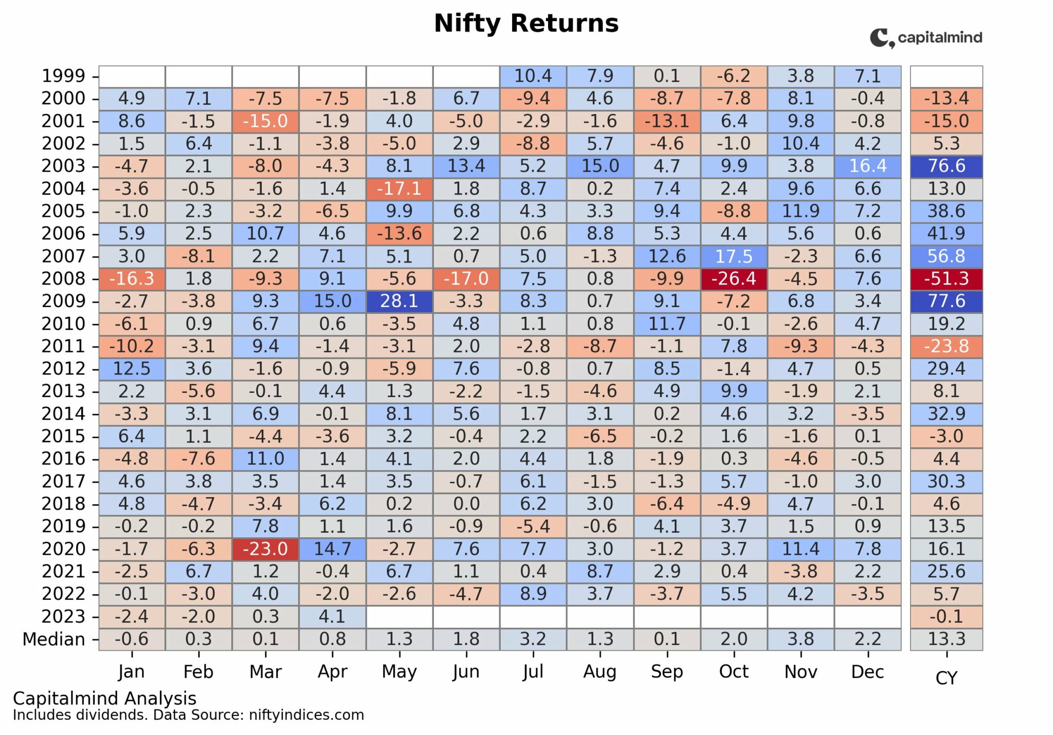
Where are we today? closer to a “top” than to a bottom, even on valuations. At 26 P/E this is not a cheap market. (Nifty P/E was 14 in 2002, and 27 in 2007 end)
The idea that markets will beat inflation over some term – even 10 years – is a lot about how expensive when you buy. The same applies for stocks. Great stocks can still hurt if you buy them only when they’re expensive. That’s also why SIPs work better – they stretch your investing time over investing cycles, so the market is expensive sometimes and cheap other times.
However, most of the SIPs that have started in the last year have only been buying into an expensive market. Will they stick around if the markets get cheap? History tells us otherwise. Hopefully such charts will help you decide.


